Building renovation
Via Richard
Type
Location
Via Richard, Milan
Year
2019
Surface area
4000 m2
Client
Private
Head Designer
Arch. Marco Vigo, Arch. Alessia Garibaldi, Ing. Giorgio Piliego
Professional services
Concept
Via Richard
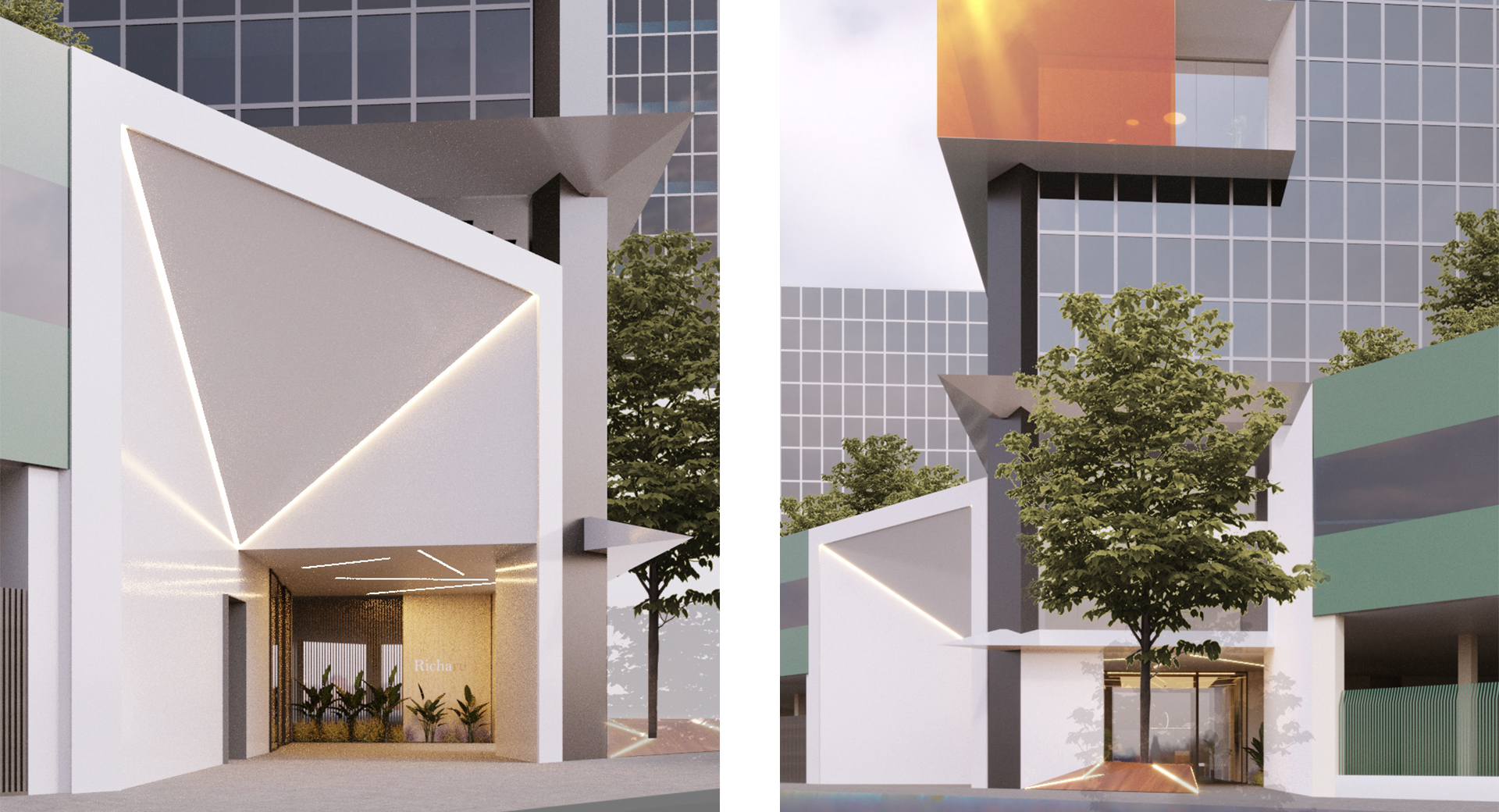
An architectural project for the redevelopment of the facades, the new entrance on the ground floor and the design of the communal areas of the building located in Via Richard in Milan.
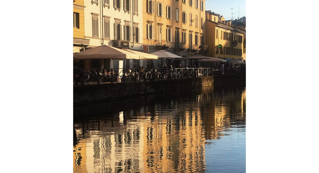
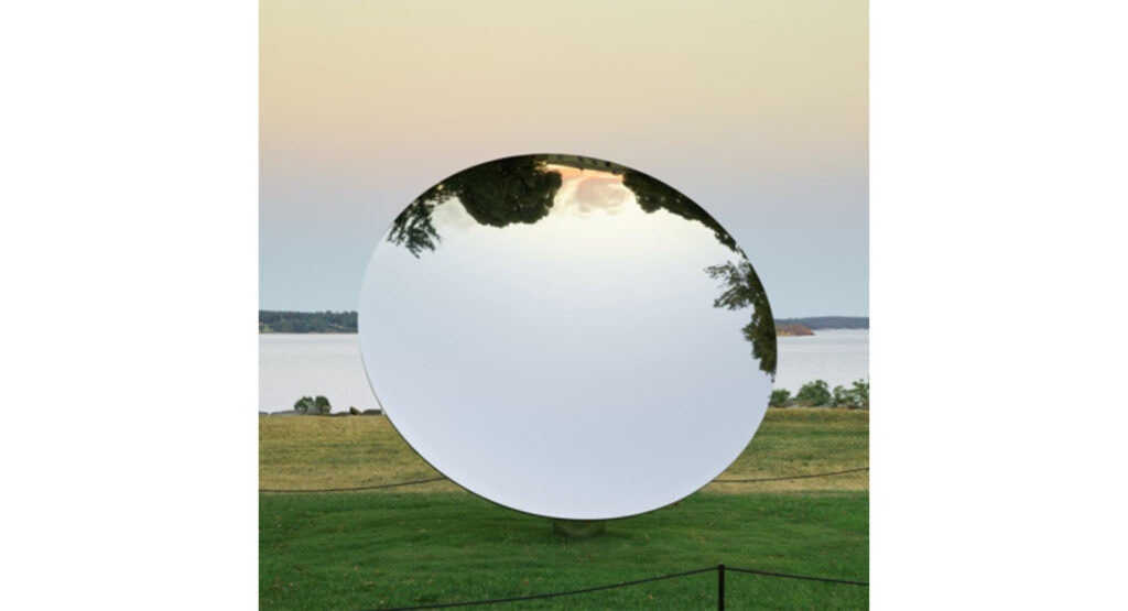
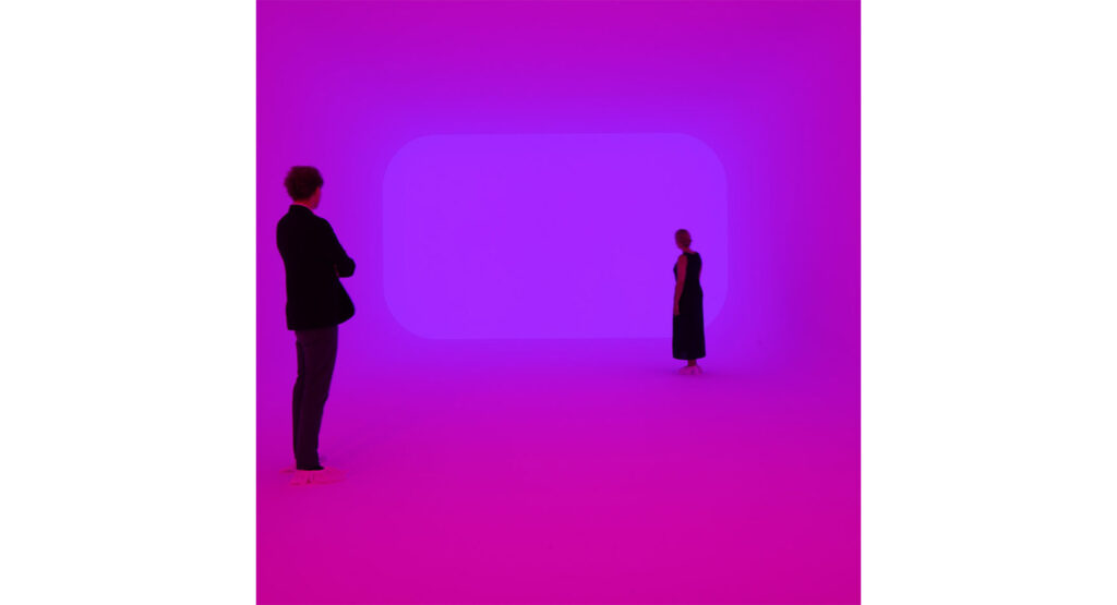
The concept takes inspiration from the Naviglio, the system of interconnected canals in Milan where the building is located, as well as from the works of artists such as James Turrell and the study of reflections of light.
These specific interventions are aimed at upgrading the building by redefining key elements of the building such as the entrance and the shared areas, with strategic use of the budget.
The proposed project is divided into two different phases identified below as Phase A and Phase B.
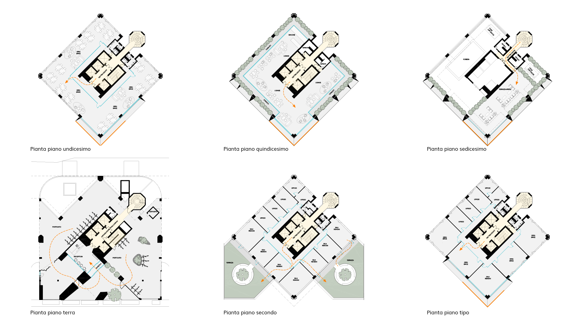
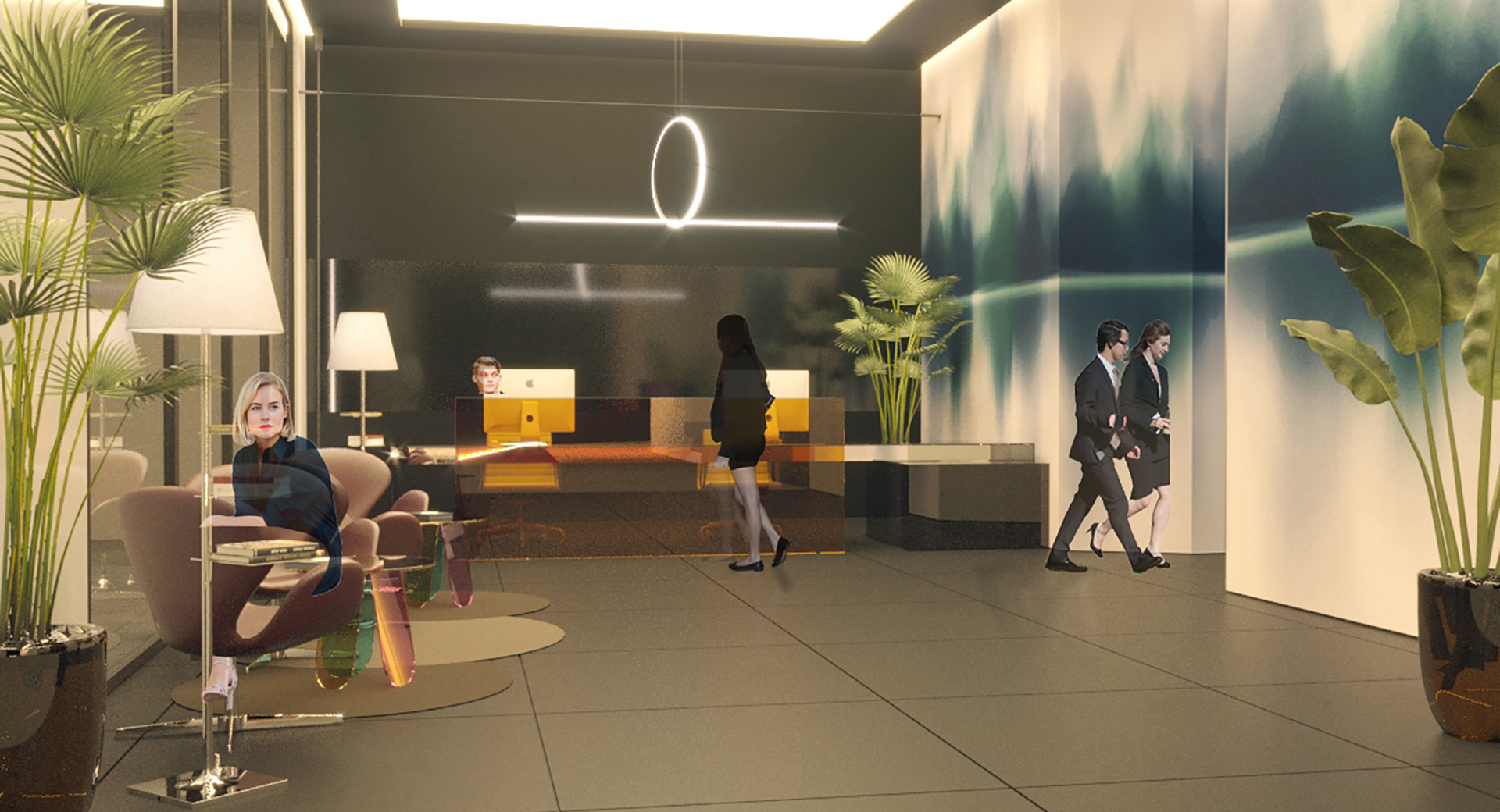
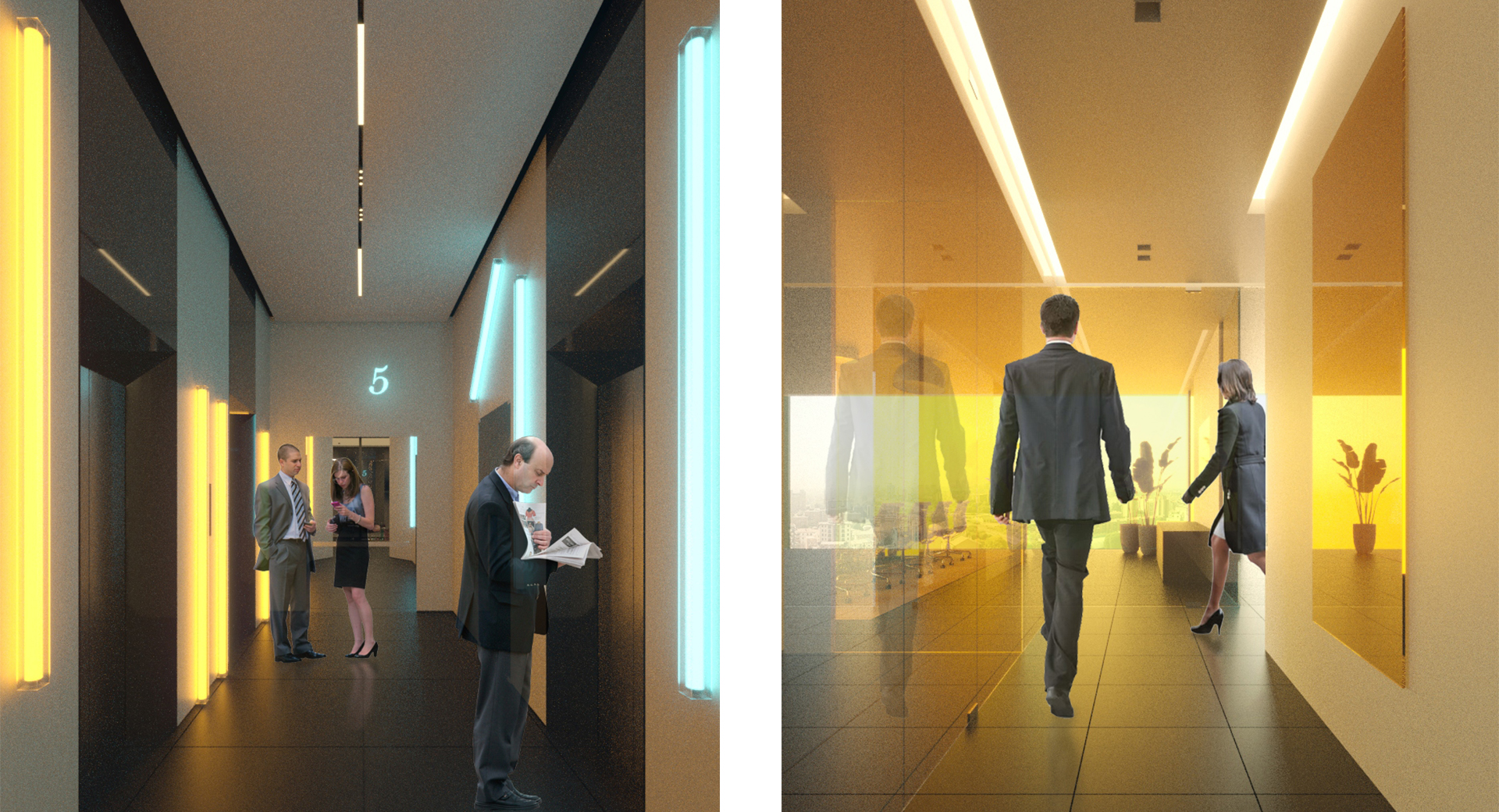
Phase A consists of creating a new entrance, a new reception and the renovation of the hallways on all floors up to the fourteenth.
Phase B integrates the design in Phase A with new work related to the redevelopment of the facades of the building.
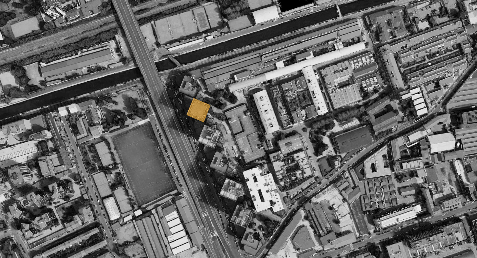
URBAN CONTEXT
The building complex consisting of seven towers of variable heights, between 15 and 17 floors above ground, was built in 1989.
The complex is characterized by the towers being anchored on a communal plate, from which it is possible to access the underground garages. It also houses some technical rooms. The porticoed ground floor contains the entrances and reception areas. Accesses to the floors consist of load-bearing concrete cores with one staircase and four lifts. The building has offices from the first to the fifteenth floor. The mainly square regular floor plan is ideal for open-plan offices as well as rooms that can be divided with movable walls.
Finishes vary according to the customizations made by the tenants: the partitions are mobile prefab and/or made of glass, the raised flooring is covered with carpet or parquet, the false ceilings are made of aluminum slats or soundproof panels, the toilets are covered with ceramic material.
The sixteenth and top floor is used as a terrace, where other technical rooms and mobile phone repeaters are located.
Inspire
Inspiration begins to take shape by casually observing a stain of colour:
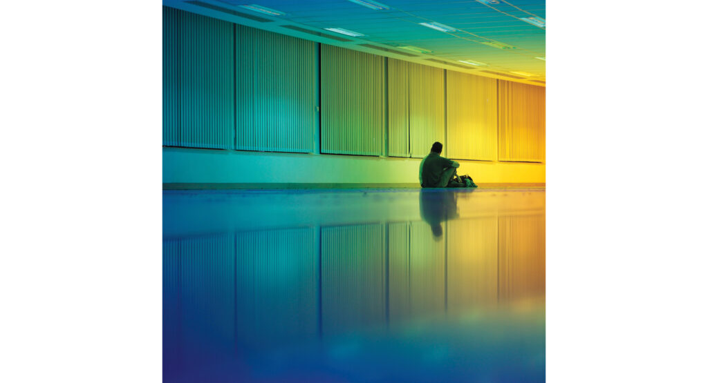
an oil slick between the streetcar tracks refracts the light breaking it up into a liquid rainbow.
The tower’s context is characterized by the presence of the Naviglio, from the flow of its waters which reflect the iridescent colours of the city. Numerous allusions are created between the built space and theatmosphere in which it is immersed, such as the transparencies of the curtain wall that seem to recall the diaphanous nature of water.
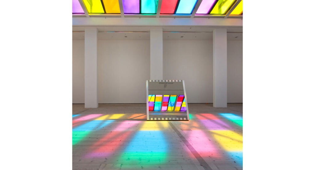
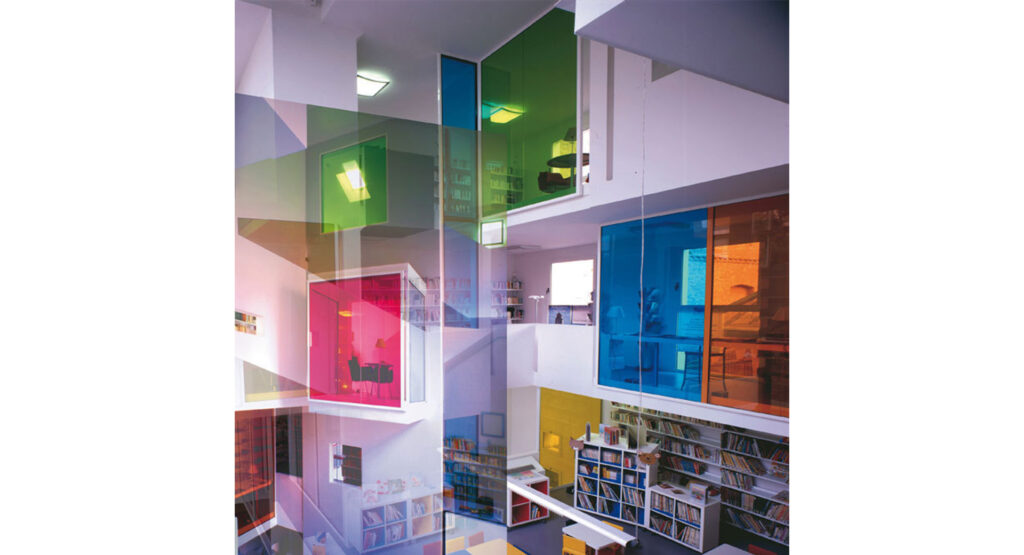
The use of colour as a characterizing element of the space itself.
Taking inspiration from James Turrell’s Ganzfeld works, as well as from the works of Olafur Eliasson, this mood uses light to generate real chromatic volumes, delineate the different layers that will be grafted onto the tower and create a malleable and mutable composition.
Redefine
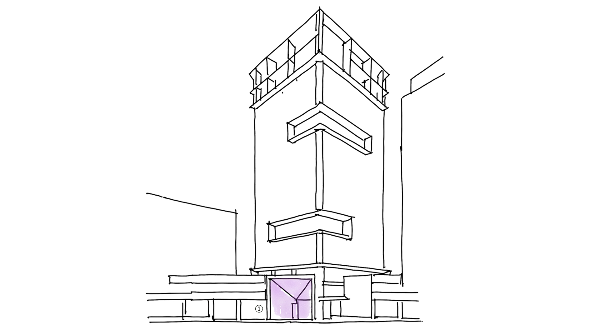
1. ICONIC ENTRANCE VISIBLE FROM THE STREET
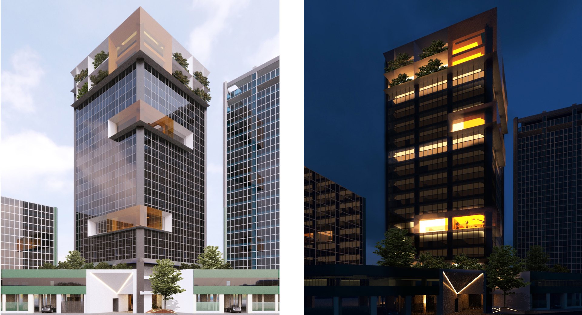
The entrance is characterized by a portal that runs from ground level to the second floor and is able to create a clear identity by framing the projecting volumes of the facade. This portal brings the entire tower back to human scale while setting itself as an urban mark capable of channeling the flows that pass through it, restoring the image of the context with clever use.
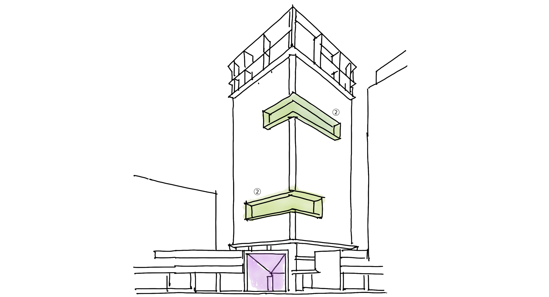
2. UPGRADING THE BUILDING WITH A TARGETED INTERVENTION
The trunk of the towers will have precise interventions specifically on the 5th and 11th floors, with the creation of metallic frames that, set apart from the curtain wall, form volumetric compositions grafted onto the body of the building. Therefore, layers are superimposed not only vertically but distributed over the entire volume of the tower, generating an aesthetic and functional enhancement that does not require extensive intervention. The frame technology envisages LED lighting which may vary in colour and which will characterize it at night depending on the need. A double glass window closes the projection, emphasising the volumes.
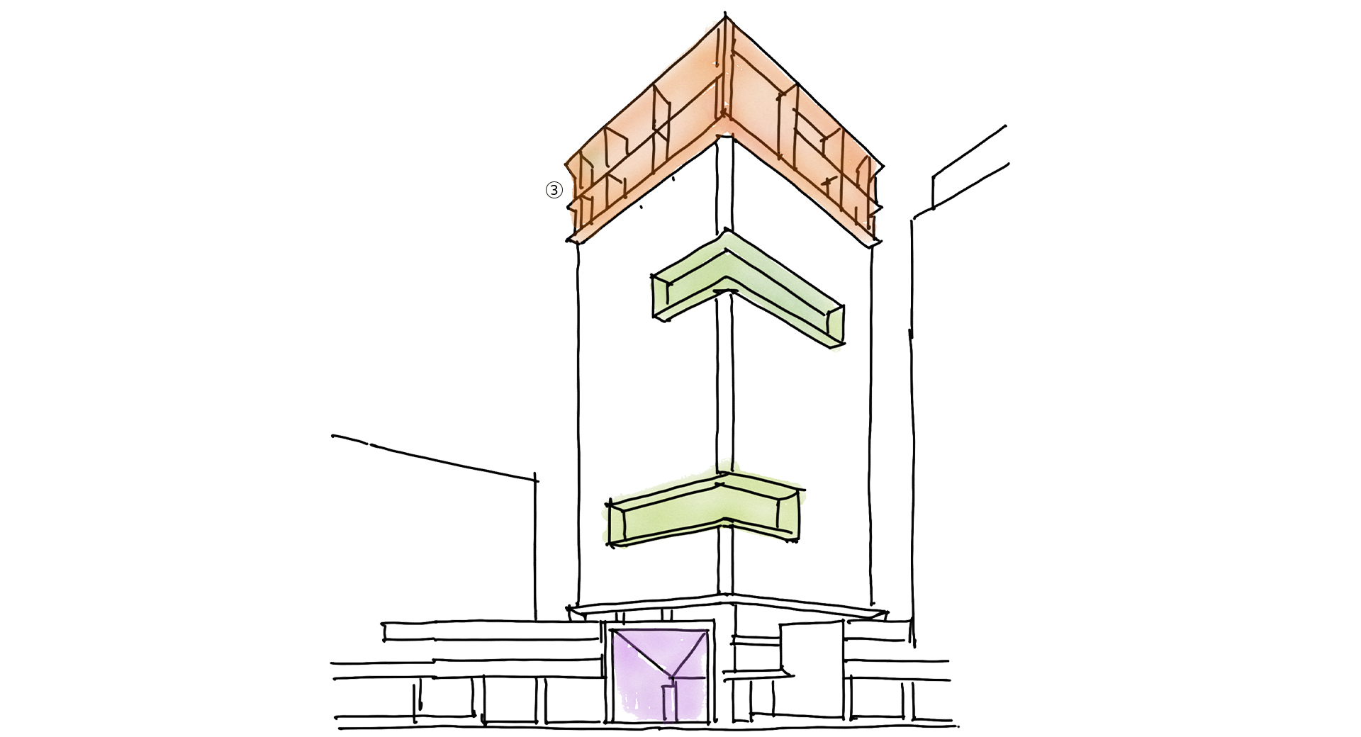
3. STRATEGIC USE OF THE BUDGET WITH PRECISE INTERVENTIONS
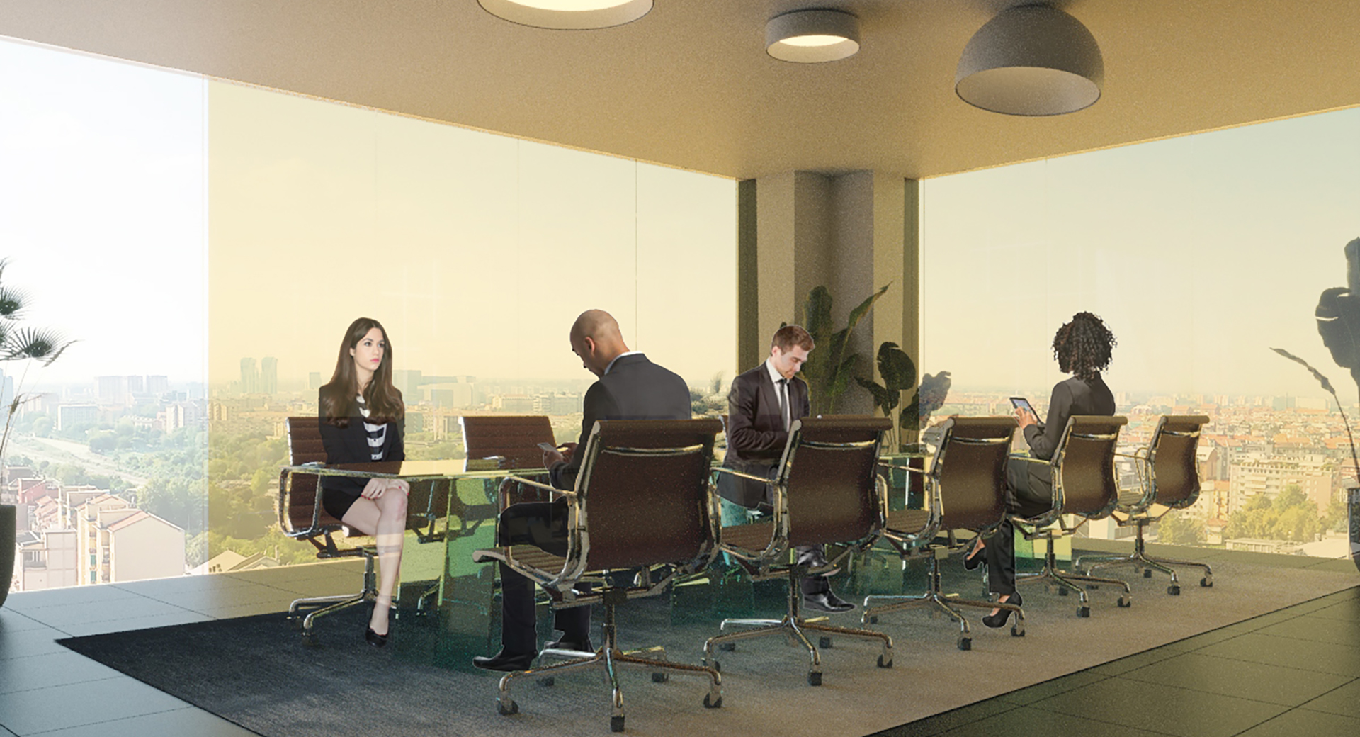
To crown the tower, the project envisages a functionalization of floors 15-16. The pre-existence of a structural floor allows the creation of multi-purpose appurtenances that will be considered the social environments of the building: on the metal frames of the facade outline, all around the tower, the rooms that will be the recreational aspect of the building and will have a privileged view over the Milanese skyline. A arboreal graft closes the composition of the 16th floor, providing the tower with a hanging garden and ensuring covered space.
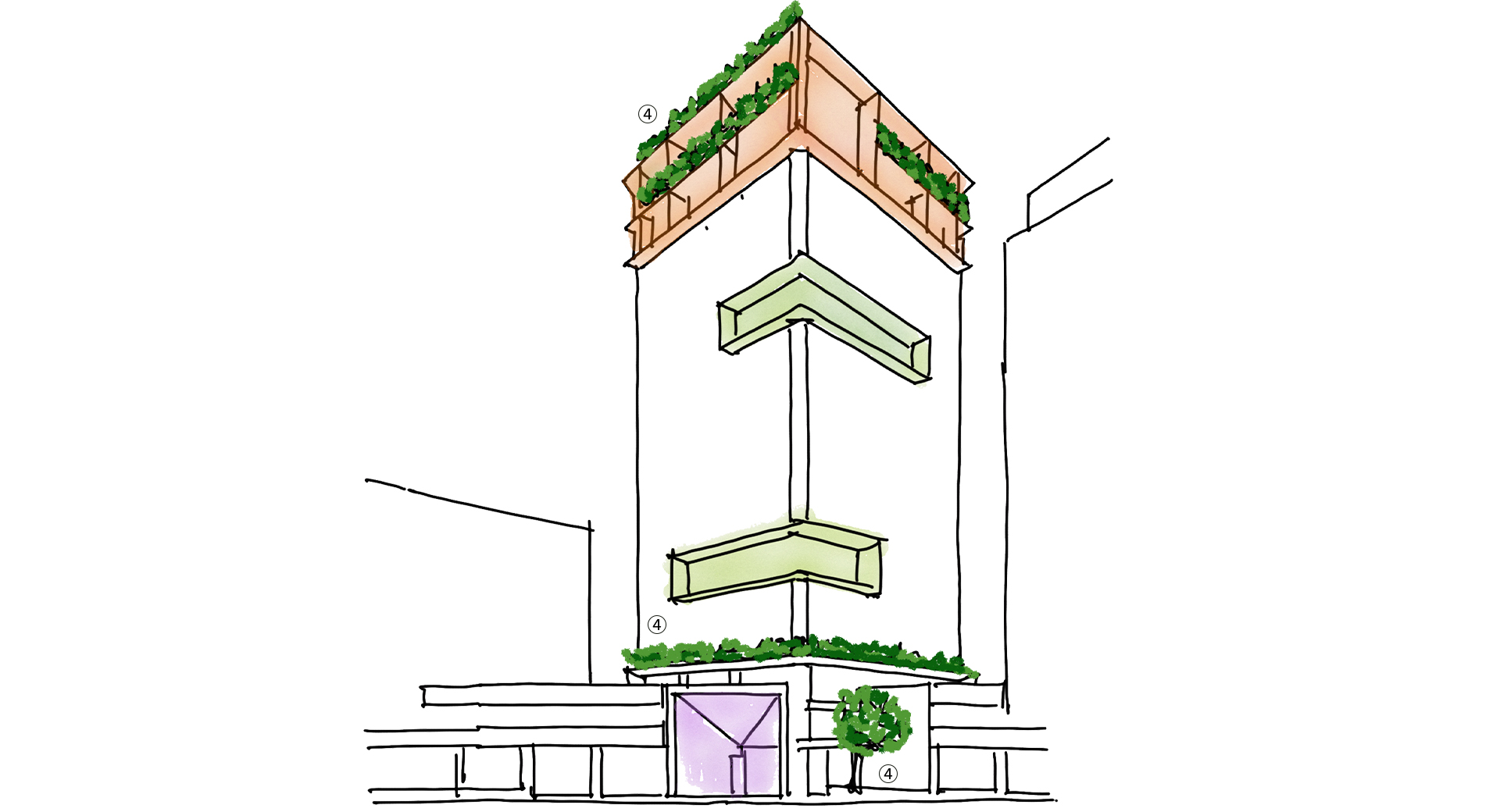
4. INTEGRATION OF GREENERY IN THE NEW SOCIAL AREAS
The project envisages the use of the terraced area, redeveloping it architecturally. The existing curtain wall will be set back, creating a significant and representative space that can be devoted to different uses as needed. This multifunctional environment will communicate directly with the outside creating a visual continuum capable of enhancing the floor space. The terraced space will be endowed with greenery in order to increase the quality of the communal spaces.
Invent
PHASE 1
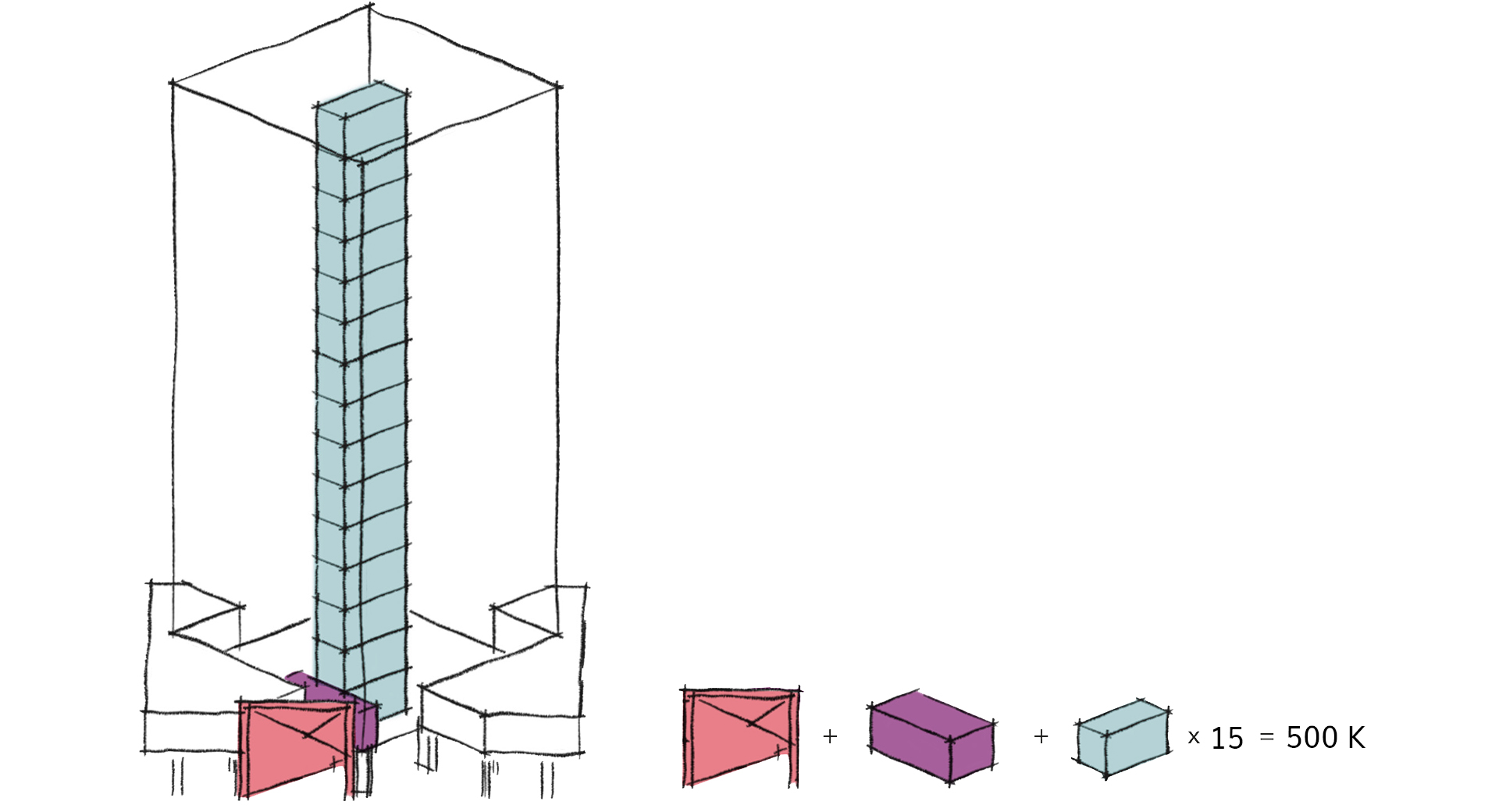
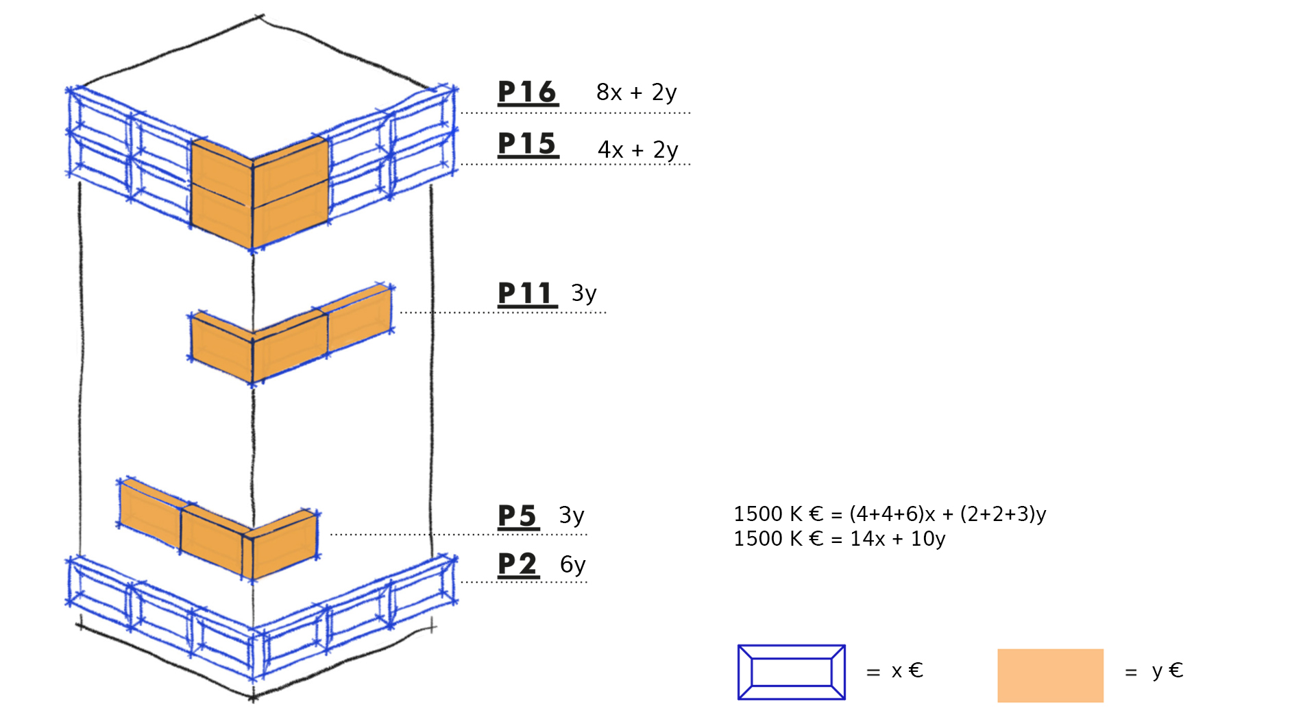
Strategic use of the budget consists of splitting the project into several interchangeable interventions and the possibility of modularly changing the design of the tower.
PHASE 2
The type of precise intervention makes the project replicable according to availability. The construction scheme is based on the assemblage of the elements of the project that are then inserted into the building.
